

Renasense
A sensory experience honoring change for expecting and new mothers.
Renasense is a bespoke body-care brand focused on empowering women during their pregnancy and postpartum journey with its carefully crafted cold-pressed, organic oils for stretch mark care. Founded by Alexandra Guglietti, an Italian-Canadian formulator devoted to holistic wellness, Renasense blends intentional craftsmanship with a soothing sensory experience, nurturing both body and spirit to help mothers embrace and heal through change.

Challenge
Alex’s vision was to create a product that not only addressed the physical needs of pregnant women but also rekindled their sense of self beyond the realm of motherhood. Inspired by her Italian roots, the allure of the Amalfi Coast, her background in art history, and her passion for the Botticelli figures in 16th-century Italian paintings, we sought to develop a bespoke product and brand. This brand would evoke a sense of adventure and escape, allowing women to experience the elegance and tranquility of Italian artistry while tending to themselves in the comfort of their own homes.

Opportunity
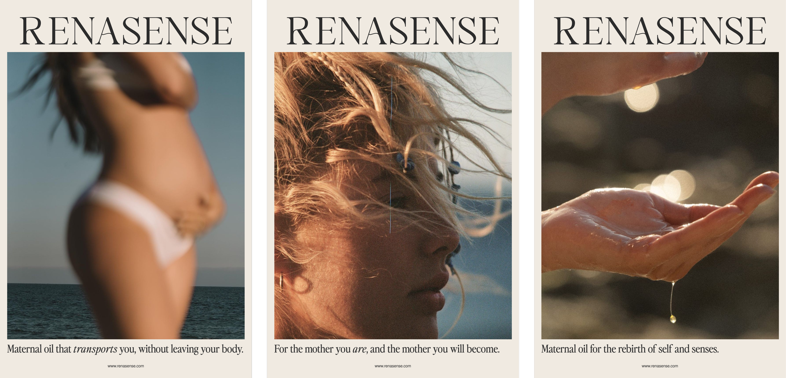
The opportunity in this project was to develop a brand that not only supports mothers through their journey but also celebrates the beauty of their bodies. Inspired by 16th-century Italian paintings that glorify the curves and fullness of the female form, the brand seeks to evoke a sense of wonder and appreciation for the shape of pregnant bodies. By incorporating elements of the sea and distant lands, the brand aims to draw mothers into a sensory experience that inspires deep self-care and dreams of new adventures. This project allowed us to blend the timeless elegance of classical art with the nurturing spirit of the sea, creating a brand that honors the body and the soul.


Approach
Research and brand strategy
I worked closely with Alex over the course of three months to refine her vision, aligning it with her mission to create a brand that heals and inspires. This involved extensive research into the needs and desires of pregnant and postpartum women, and gathering visual inspiration. We identified key themes that resonate with this audience, such as the desire for self-care, a sense of adventure, and a need to feel beautiful and empowered during and after pregnancy. We also gathered insights into the types of messages that evoke strong emotional responses from the target audience, focusing on the celebration of the body and the honoring of the motherhood journey. This in-depth research allowed us to create a comprehensive strategic document outlining the brand's messaging, tone, company values, and consumer insights. The document serves as a blueprint for all brand communications, ensuring a consistent and compelling narrative that speaks directly to the hearts and minds of mothers everywhere. By positioning Renasense as a brand that not only provides physical nourishment but also emotional support and inspiration, we were able to create messaging that is both powerful and authentic.
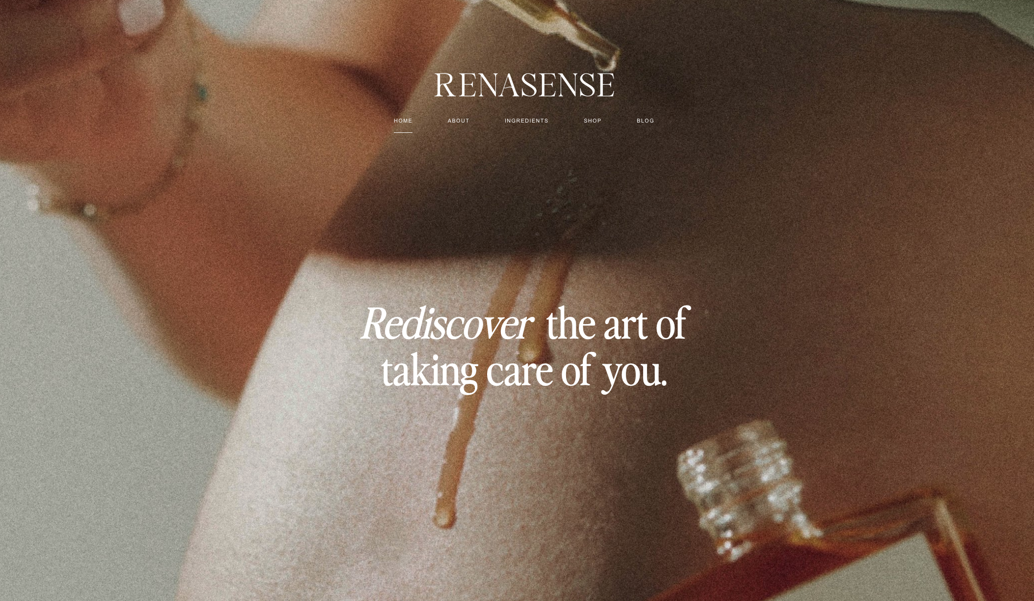
Visual brand identity
The visual branding for Renasense was crafted to convey a message of self-care, leisure, and the importance of maintaining a sense of identity beyond motherhood. Drawing heavily from Alex's Italian heritage and her love for art history, we created a unique and evocative narrative that blends classical beauty with modern aesthetics. The visual elements of the brand were designed to be rich and vibrant, reflecting the colors and textures of the Amalfi Coast and the lush landscapes of Italy. This approach not only pays homage to the brand’s roots but also creates a sense of elegance and sophistication that appeals to the target audience. The brand story we developed emphasized the beauty and strength of the female form, celebrating the curves and fullness of the body during pregnancy and beyond. Through careful selection of imagery, typography, and color palettes, we were able to create a visual identity that is both timeless and contemporary, capturing the essence of the Renasense brand and its commitment to nurturing the body and spirit of mothers.
Creative direction
The creative direction for Renasense focused on crafting a packaging design that reflects the brand's ethos of self-care and adventure. The packaging design was inspired by the breathtaking scenery of the Amalfi Coast and the rich artistic heritage of 16th-century Italy, incorporating elements that evoke a sense of escape and luxury. We used rich colors, such as deep blues and golds, to represent the sea and the sun-drenched landscapes of Italy. The choice of luxurious materials, such as textured papers and elegant fonts, adds a touch of sophistication and refinement to the packaging, making it a joy to open and use. By incorporating elements reminiscent of classical art, such as delicate floral patterns and ornate borders, we were able to create a packaging design that is both beautiful and meaningful, resonating with the brand's target audience. The result is a packaging design that not only protects the product but also enhances the overall brand experience, inviting mothers to indulge in a moment of self-care and escape from the everyday.


Outcome
Through strategic development, comprehensive branding, and meticulous packaging direction, Alex and her team successfully launched Renasense in 2024 as a premier bespoke body care brand. The carefully crafted cold-pressed oil has garnered acclaim for its quality and efficacy, earning positive reviews from both customers and industry experts. In addition to the product's success, Renasense has established valuable partnerships with wellness creators that enhance its market presence and credibility. The brand elements and messaging we developed for the company are consistently and elegantly integrated across all customer touch-points, including media, packaging, and the website, creating a cohesive and immersive brand experience that resonates deeply with its audience.